What is it?
Pareto analysis is a technique for recording and analysing information relating to a problem or cause, which easily enables the most significant aspects to be identified.
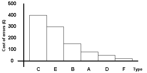
A Pareto diagram is a special form of vertical bar chart, or column chart, which allows the information to be visually displayed.
When to use it
- Separating the 'vital few' from the 'useful many' problems, (80/20 rule).
- Selecting major problem areas
- Identifying major effects and causes
What does it achieve?
" First things first" is the thought behind the Pareto diagram; the properly constructed diagram should suggest on which error or activity resources should be used first to make the best improvement.
Very often the simple process of arranging data may suggest something of importance that would otherwise have gone unnoticed. Selecting classifications, tabulating data, ordering data, and constructing the Pareto diagram have often served a useful purpose in problem investigation.
The communication process between people takes on many forms, and Pareto diagrams are a form of language using a display in a commonly understood format. The continued use of the Pareto diagram enhances communication between members of staff and through all levels of management.
Key steps
- List the activities to be analysed
- Calculate totals
- Order totals
- Draw the Pareto diagram
- Interpret results
Pareto Diagram example
