What is it?
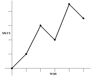
Line graphs are a common way of presenting data in the form of a picture.
They show the direct relationship, for example, between two quantities at a glance
When to use it
- Gathering data
- Analysing data
- Planning and implementing solutions
- implementing and testing solutions
- Ensuring continuous improvement
What does it achieve?
In the problem solving process, it is often easier to see results when they are displayed on a graph than if the results were presented in the form of a table.
Seeing how variables have changed in the past can give a useful guide as to what can be expected in the future.
Summary
- Time series graphs are used to show relationships between a variable and time
- An index chart can be used to show percentage comparisons
- A frequency polygon is used to show frequency distributions
- An Ogive is used to show cumulative frequency distribution
- A conversion chart can be used to display the relationship between two variables